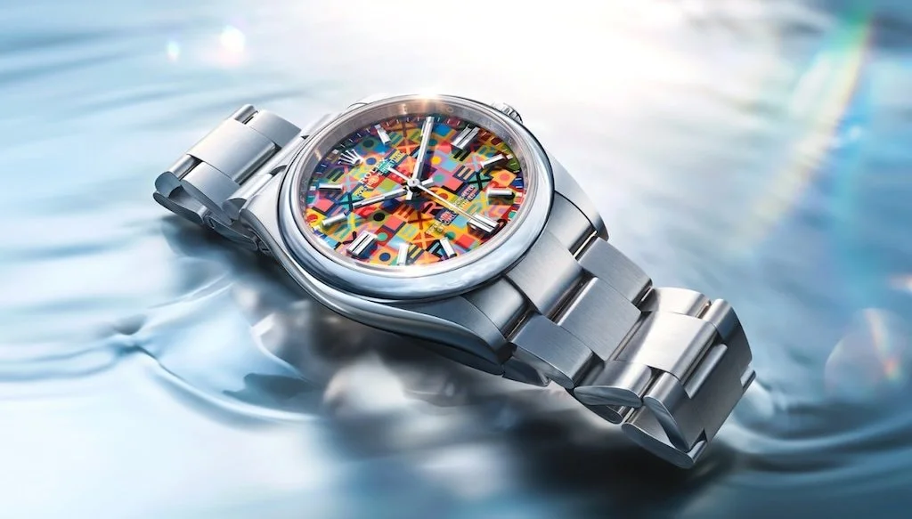
The new OP 36 with a Jubilee dial. (Photo credit: Rolex)
When Rolex developed a new gold alloy for the Day-Date, the brand struggled to describe it. "We couldn't define what shade it had," a Rolex representative in Geneva told me. "Obviously, there is play of light. But some people saw it as more pink, some as more yellow, and others as more gray," she said. The brand settled on "Jubilee Gold." In its press kit for Watches and Wonders this week, it did not assign it a single color, but three.
In a day and age of computer-generated images, which present new releases in perfect conditions, Rolex is increasingly having the opposite problem. Today's images fail more and more to capture the nuances of Rolex's creations. "It's true this year even more so, I would say," the representative told me.
If last year’s release centered on the Land-Dweller and its revolutionary Calibre 7135, this year is about la maîtrise cadranière, or mastery of the dial. The part of the watch that offers Rolex the most creative freedom is also the one that photographs do the least justice.
"For example, there are many people who didn't necessarily like the new Jubilee dial in photos," the brand’s representative said. “And when they saw it in real life, they saw how well the colors stand out because the watches are about emotion. And they saw how much perfection there was in the execution of this dial, which they didn't realize in photos," she said.
The OP's Jubilee dial is not the only dial where computer-generated images have reached a limitation at Rolex. Photos of the new Daytona with a white dial and white sub-registers have difficulty capturing the chronograph's "slightly vitreous aspect of enamel," she said. "The same with the light green aventurine of the Day-Date dial with its subtle colors which play with the light." Even the new Yacht-Master II features a never-before-seen white lacquer coating on the dial, a first for the collection, designed to reduce reflections.
On the dial of its gold OP in 28 and 34, Rolex decided to cut the stone differently, using an ogive cut that eschews the typical play of light and keeps a matte effect to better match the color of the dial, a detail that is hard to pick up in photos. Rolex paired those OPs with a fully brushed gold case and bracelet. It was only after seeing the brushed-gold OPs in person that Tony Traina, a watch journalist, said it was his “favorite execution” from Rolex.
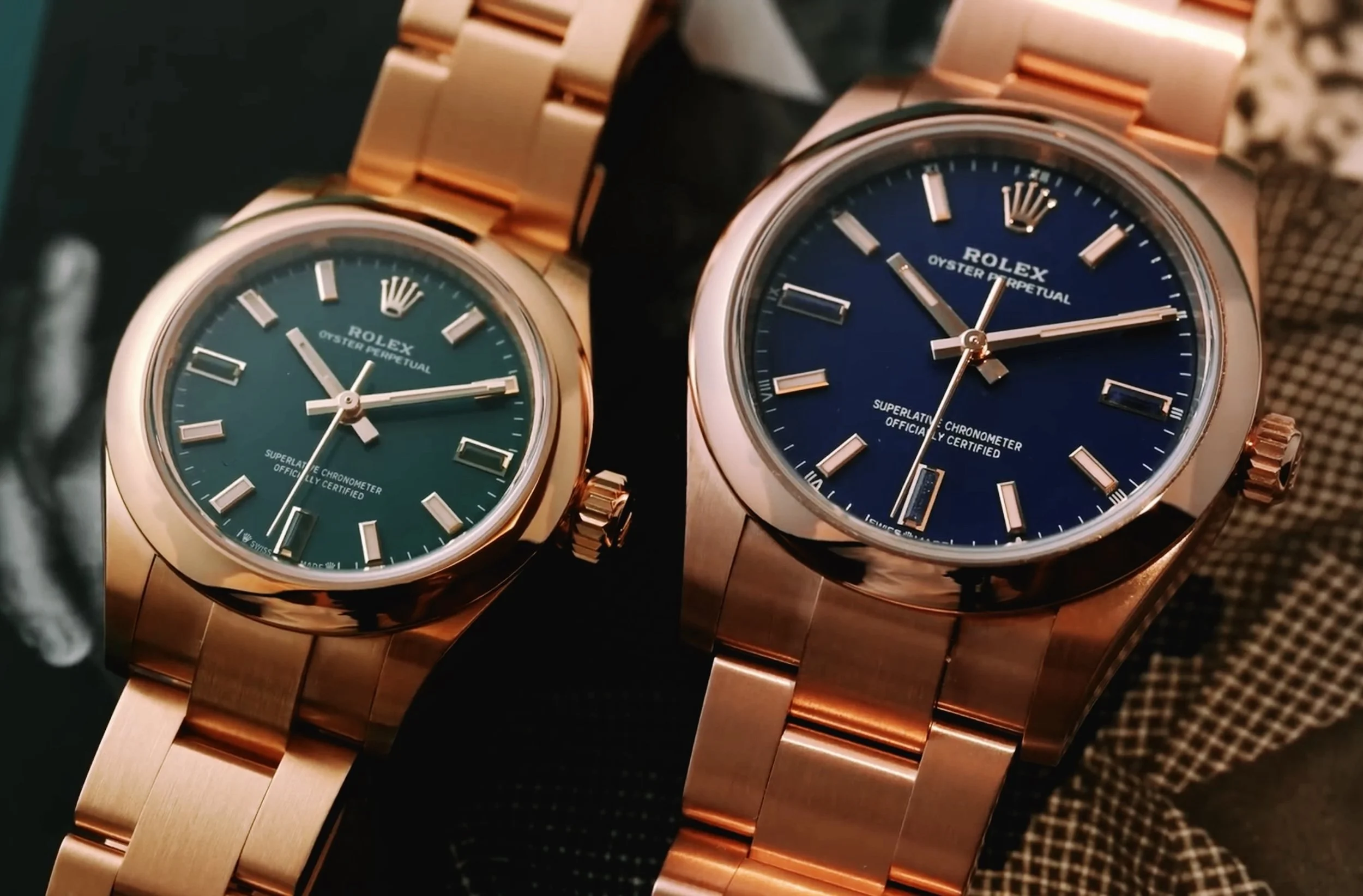
The full-gold OPs in 28 and 34. (Photo credit: Les Rhabilleurs)